
This is a slightly different template. I wanted something with just a bit more structure and a bigger selection of post styles. It’s not a lot different from the previous one, even wider than Able (this is Zoren). It’s very wide and I notice it mostly when I’m writing because the lines are much longer than I am used to. I haven’t decided whether or not I like it, but I need to work with it for a while to see.
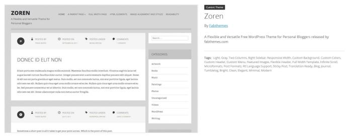
Otherwise, it’s got the column on the right rather than the left and what I think are somewhat easier to read typefaces. I like the layout of the blog title above the graphic. The template allows using a full-size picture below the title, but I’m trying to keep them small to make loading the blog less difficult for people who use portable devices.
I welcome feedback!!
My WordPress wish list includes a nicer holiday template to use for the next few weeks. They only have one — a bit squinchy for photography. Oh well. Let it snow!
Related articles
- Serif vs. Sans Serif Fonts: Is One Really Better Than the Other? (designshack.net)
- Beyond words: how fonts make us feel (mumbrella.com.au)
Share this:

Categories: #Blogging, WordPress
 DON’T LET THEM NEAR A COMPUTER
  BLOGGING INSIGHTS: FIX OR BREAK?
  WONDERING ABOUT WORDPRESS
  I HATE WORDPRESS
It’s a thumbs up from draliman!
I’m finding it neater and more modern-looking. Of course that might be because I’m so used to the other one and this is a change, but I still like it 🙂
LikeLike
I like it. It is crisp and clean and easy to follow. I played around a lot at first with themes. It’s so tempting to change. Sometimes I get a little upset when someone changes their format (like MY opinion matters) I guess I like familiarity and being able to recognize my favorite blogs at a glance.
But this, I really like.
LikeLike
Thank you. That’s exactly what I was trying to achieve! And your opinion matters. That’s why I asked for it!
LikeLike