
THURSDAY’S SPECIAL: SATURATION
FROM PAULA: I am sorry I can’t always keep this photo challenge a weekly event due to my ever-increasing workload and stresses at work, but whenever I can, I’m happy to be here to challenge you and look at your entries. For this week I thought it would be a good idea to tackle “saturation”. It can be interpreted as colour saturation in photography – especially evident in the image post-processing, which is what I did in my examples below, but you can also take it from another angle. Did you know that you can be saturated with work too?
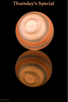
I can’t get to my photography in a normal way because I’ve been hacked and my PC is closed down until it gets fixed. So … I winged this one. Probably not my most brilliant work, but it was as good as I can do on this computer without any of my normal processing tools!

Is this more or less saturation? Technically, this is higher saturation but I think it appears less saturated because I changed the tint slightly.

As I said: technically, this is less saturated than the first picture. Really, the problem is not just definition, but perception. Same picture, but the details are sufficiently different to change the nature of how you see it.
Share this:

Categories: #Photography
 A PASSING BOUQUET
  AMERICA’S INDUSTRIAL REVOLUTION
  EARTH BY THE BLACKSTONE
  ROUGH AND TUMBLE
Saturation or lack thereof is tricky. But thanks. You’ve given me something to dwell upon, as I learn more about DE-saturation versus going ‘grayscale’ in Photoshop. Much better detail (IMHO) desaturating a color photo versus the stark black and white (and grey) of gray scale. A preference perhaps. One of my favorite flowers is the sunflower. Thanks for providing such a beautiful example of one…
LikeLike
Garry asked me to remind him what saturation IS and I said “color intensity.” But how your mind sees it is something else. I often LOWER the brightness of a picture to bring up the the colors. There’s also the temperature of the color and the tint — AND the level of detail and all these make your eyes see the picture differently. If you took one picture and did nothing but turn up or down using the saturation slider, that’s what you’d see, but inevitably there are other changes that affect how you see it. And of course, your monitor changes everything.
LikeLike
The first one must be super saturated because you can’t see the detail of the inner part of the flower, lovely sunflower.
Leslie
LikeLike
The second pic is richer to me. More detail, more separation. Easier on the eye.
The first one is murky. Hard to see Mr. Bear or brick wall in background. Maybe a color noir pic?
I just saw Leslie’s comment, above mine. I guess less saturation is better??
LikeLiked by 1 person
I think it is better with less saturation. You do lose a lot of detail with it.
Leslie
LikeLiked by 1 person
I agree, Leslie.
LikeLiked by 1 person
🙂
LikeLike
I actually reduced the contrast to get more definition, though there is also more saturation. But it isn’t JUST saturation. It’s also contrast and structure and shadow and highlight and how they interact.
LikeLiked by 1 person
they would all work together to produce the effect….
LikeLike
Exactly.. And what your eye sees may seem more intensely saturated, but it might not be saturation at all, but other factors.
LikeLiked by 1 person
There’s a lot involved in this…
LikeLike
And it is why those “drug store” prints you used to get were s unsatisfactory.
LikeLiked by 2 people
Things have come a long way from those days.
LikeLiked by 1 person
Psycho Pervs used to process the film in drugstores. See Robin Williams in “One hour Photos”.
LikeLike
I think the first one has more intense contrast. That totally kills definition.
LikeLiked by 1 person
🙂
LikeLike
beautiful.. nothing like a sunfower
LikeLike
They are very sad right now and need to be thrown away. I HATE throwing away flowers, no matter how old they are!
LikeLiked by 1 person
Nice! I’m no expert on saturation… I’m still learning about it myself, but both pictures look nice to me.
LikeLiked by 1 person