
Cee’s Fun Foto Challenge: Pastel Colors
I’ve been doing a lot of pink lately for the September Pink-O-Thon … so now I need to find some pastels that I haven’t recently used. Surely I’ve got some that are not pink, right?
Sure I do. I just need to find them.
Somewhere in my 100,000 photographs, they are waiting for me. Waiting …

One pastel kitten – Photo: Garry Armstrong

The soft tones in the mosaic in downtown Uxbridge – Photo Marilyn Armstrong

Softly falling water – Photo Garry Armstrong
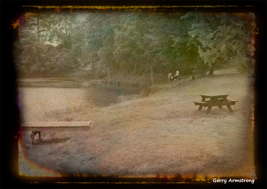
Gently nostalgic by the Blackstone River – Photo: Garry Armstrong

Softly lit orchids – Photo: Marilyn Armstrong

Soft begonia macro – Photo Marilyn Armstrong

Graphic stone and falls – Photo Marilyn Armstrong

Pastel dam and falls – Photo Marilyn Armstrong

The falls and grasses – Photo Garry Armstrong

Share this:

Categories: #DamsAndWaterfalls, Cee's Photo Challenge, Garry Armstrong

I really loved the one with the orchids. They’re all beautiful. 🙂
LikeLike
I loved my orchids too. They finally all dropped off, but I think there’s a new set coming out. There’s a new “branch” so I’m optimistic.
LikeLiked by 1 person
Cool. I just got a small orchid, it’s blooming now. Pretty purple flowers. I’m hoping it will last a while, most of my plants die pretty quick. 😦
LikeLike
D0 NOT overwater it. More plants die from too much water than too little. Put it by a window that’s bright, but not always full sun. Then be patient. DO NOT OVERWATER. Wait until the soil is really DRY. Not moist. DRY. And good luck!
LikeLiked by 1 person
Thanks for the tips. I think I will be OK with the overwatering. I’m usually gone for at least a week at a time. Sometimes 2-3 months out on a ship. Thats why all my plants die.
LikeLike
Yeah, 2 month is a death knell. Get someone to drop by once a week and water them.
LikeLike
These are all so lovely Marilyn.
LikeLike
I generally like soft colors anyway, though I’m learning to like stronger hues too. It probably has to do with liking to wear soft colors, so I tend to get pretty monochromatic 🙂
LikeLike
Marilyn, you have a marvelous gallery of pastels for this week. 😀 😀
LikeLike
Thanks, Cee. I think this is what I do best, or at least, one of the things I find easiest to do.
LikeLike
Lovely, Marilyn, the cat is really cute too.
Leslie
LikeLiked by 1 person
The barn was full of cats and kittens. Dozens of them. This is the local “cat saving” farm. But he is always glad to pass you a kitten(s) should you want a few.
LikeLiked by 2 people
Marilyn, the kittens all came out…when I came in.
LikeLike
That would be tempting….
LikeLike
Not with three dogs at home and one losing her sight. Right now, we are a bit over-dogged!
LikeLiked by 1 person
That would be complicated alright….
LikeLike
Leslie, Kitty thanks you.
LikeLiked by 1 person
Yes it did look young…
LikeLike
No matter the color, these are award winning photos.
LikeLiked by 1 person
I like soft colors. Lately, I’ve been experimenting with brighter, sharper colors, but my favorites are always soft.
LikeLiked by 1 person
I love colour so much! From bright vivid to soft pastels. It would be difficult to choose lol but I surely love your photos, they are always vibrant with meaning.
LikeLike
Love the feeling of the soft colors and their texture. Soothing.
LikeLike
Just a simple theme of pastel and then I realized that inhave few photos in pastel
LikeLike
Sometimes, that’s just what the colors really are. I find pastel and soft colors easier to work with than harder edged colors, but many others are the exact reverse and find the pastels harder to handle.
LikeLiked by 1 person
Is the Blackstone River photo really old or is this a photoshop technique? I love it.
LikeLiked by 1 person
It’s a technique. Garry took the picture in August. Or maybe July. But this summer for sure.
LikeLiked by 2 people
“Softly, as in a summer morning sunrise”……
LikeLike
Life, The Blackstone is — “The River of No Return”.
LikeLike
Why is it the river of no return, Garry?
LikeLike
It’s a movie starring Marilyn Monroe and Robert Mitchum.
LikeLike
Aha.. Golden Oldie.
LikeLike
Garry is VERY big on old movies. I like some of them, but he’s a serious fan. REALLY serious.
LikeLike
Ask him what he thinks of Now Voyager! I loved that movie. I bet I’ve watched it 5 times.
LikeLike
Garry says he watches it every single time it’s on. I think he likes it.
LikeLiked by 1 person
I actually bought a copy. It is VHS, but I’ve kept a little TV with a VHS player. Think I’ll watch it again.
LikeLike
Tell Garry I’d like for him to recommend one of his favorite oldies for me to watch.
LikeLike
Or are you saying life is the river of no return?
LikeLike