
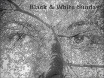
BLACK & WHITE SUNDAY: AFTER AND BEFORE
I’m always a little dubious about landscapes in black and white. Sometimes, they are great, but a lot of the time, they are a bit dull. I think this one worked pretty well. Lots of clouds piling up in the sky made the a big difference between the two pictures.

The canal in sepia. Garry with a camera and clouds.

Blue skies behind white puffy cloud. Different in color.
I can’t make up my mind. What do you think?
Share this:

Categories: #BlackstoneRiver, #Photography
 SQUARING UP – 9:02 AM
  SPRING IN THE VALLEY
  PHOTOS FROM BLACKSTONE by GARRY ARMSTRONG
  EARTH BY THE BLACKSTONE
Including Garry in the shot was a genius idea! Each of these has its own merits. In the monochrome I focus more on the symmetry of the reflection. In the second one I can notice Garry better which is cool. Fine example of how different edits create different moods. Thank you, Marilyn and Garry 🙂
LikeLike
Since they are essentially the same shot it’s not a matter of qualitative difference but rather an emotional preference. Personally i think the colour shot has a more ‘positive’ emotional response in me, makes me feel happier and uplifted somewhat. The sepia has a more sombre look/mood to it.
Not that one is better than the other just that one might suit one’s current mood better. Today, i say colour – tomorrow? who knows? 😉
I like that you posted the shot Garry was taking when you took this one, first! 😉 Gives this one a little greater ‘perspective’ to it… makes it more ‘your’ shot. 🙂
love
LikeLike
We shoot each other shooting pretty often, I think couple who photograph get a kick out of it. It is kind of cute, you gotta admit.
LikeLiked by 3 people
Indeed I do! 🙂
Just don’t start shooting with guns, OK? 😉 We hear about far too much of it over here.
love
LikeLike
Love the Black & White- amazing with the reflection- beautiful!
LikeLiked by 1 person
B&W all the way. Looks more dramatic in the sky.
LikeLike
The first photo focuses more on the perspective of the composition. The colour photo focuses on the verdant richness of nature. Both are lovely.
Leslie
LikeLiked by 3 people
Thanks! I agree.
LikeLiked by 1 person
🙂
LikeLike
Boy … i gotta get out and do some of this Summer before it’s all gone.
LikeLike
We have — when it isn’t raining. It has been raining more than not. Today, however, it is beautiful. But we just got up, so I’m not expecting us to do much. By the time we get to it, it will be evening. And it is a busy week coming up, so … day off time!
LikeLike
I like experimenting with sepia and monochrome. I have to say though that Garry looked out of place in the sepia photo. His dressing and activity seemed better suited for the color photo. Just how I perceive it – don’t know if I could explain it any better.
LikeLike
He wasn’t supposed to be a “main feature,” so I wasn’t sure I shouldn’t trim him out of the picture. Ultimately I decided he added perspective to the shot. I may try a different version next time.
LikeLiked by 1 person
I always tend to prefer the color version of such comparisons. The realist in me wants it to look like I might see it! This is a pretty graphic comparison, though — I like them both.
LikeLike
I think whether I like a black & white or not is based on contrast and texture. Both is great, but if you have no contrast, the picture is dull. This looked pretty shabby in black & white, but sepia toning improved it. I like them both too, but I doubt I would normally do this kind of picture in monochrome. To me, landscape screams “color.” I think I’m with you 🙂
LikeLiked by 1 person
Color!! No brainer. Racist?
LikeLiked by 1 person